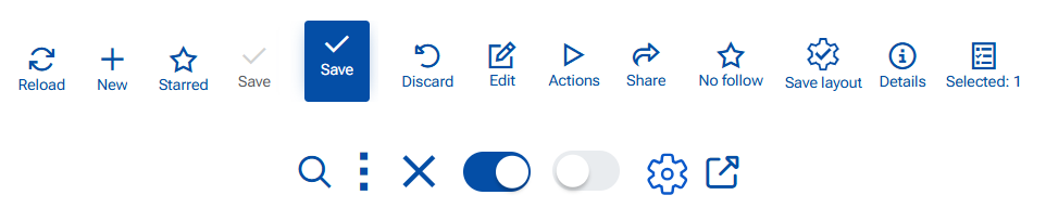
Command Buttons
Buttons are available throughout the platform—on the top ribbon, inside panels, and in the navigation panel. They are accompanied by text (which can be hidden) and a hint that indicates what will happen when they are pressed.
In our platform, we use icons and toggle switches as buttons. In this section, we explain the most common buttons found on the top ribbon of a record or navigator.
Save
Use when you want to store your changes and continue working in the same form.
Steps:
- Open a record (new or existing).
- Make your changes.
- Click Save.
Result:
- The changes are saved to the database.
- The form remains open.
- If there are no changes, Save is disabled (grey).
- If validation fails, the save is aborted and validation messages are shown.
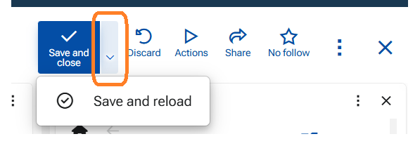
Save and Close & Save and Reload
These appear in a record that is opened as a sub-form (opened through another form). "Save and Close" is the primary action.
- Use Save & Reload when you want to save your changes and refresh the form data and stay in the form. This will save and reload the form.
- Use Save & Close when you want to save your changes and exit the form. This will save data and close the form returning you to the starting form (e.g. another form or the navigator).
Close (X)
Use when you want to exit the form without explicitly saving.
1: If No changes are made or changes are saved
- Click X.
- The form closes immediately.
2: Unsaved changes exist
- Click X.
- A confirmation dialog appears with the following options:
- Save changes
- Discard changes
- Cancel
- Always save automatically when closing - toggle switch ON/OFF
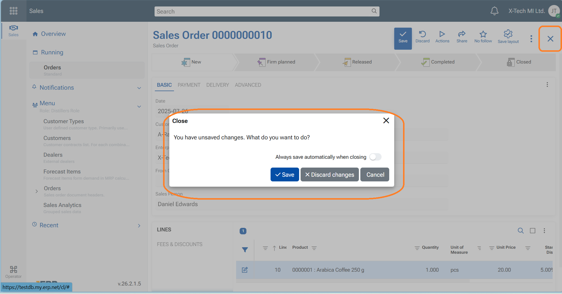
Explanation of the options
- "Save changes" - Saves the changes and then closes the form.
- "Discard changes" - Closes the form without saving the changes. The user returns to the navigator form, or the starting form)
- "Cancel" - Keeps the form open so you can continue editing.
- "Always save automatically when closing" - This is a configuration key under #71 /AlwaysSaveOnClose
Note
- When enabled, this option is saved as a user preference, which means that when closing the form with X will automatically save changes without showing the dialog and without the need to explicitly press "Save" before that.
- The configuration can be swithed ON/OFF from Main menu/Customize form/Settings tab.
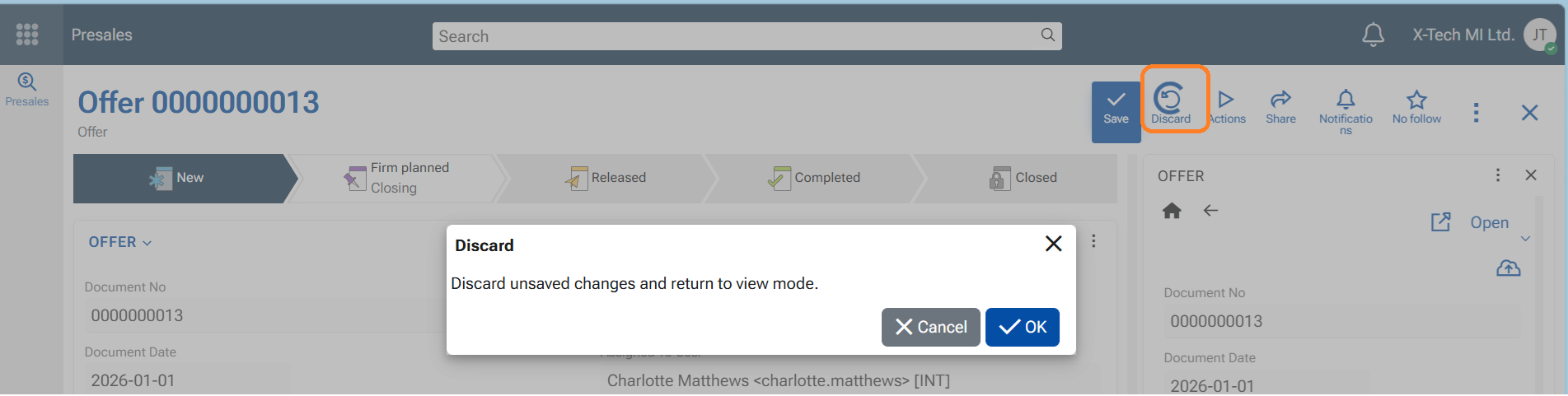
Discard
Use when you want to return to view mode of the form without saving your changes.
Steps
- Click "Discard"
- The unsaved changes are lost
- The form gets back to view mode (exit edit mode)
Toggle switch
Use to switch ON or switch OFF features. You can find it in the app-bar menu, in notifications settings, in notifications options, show elements (fields) in a form, etc.
- ON - toggle is "blue", switch goes to the right
- OFF - toggle is "grey", switch goes to the left
Edit
Use this button when you want to modify data in a form, a navigator (for example, add or remove rows, create a new record directly in the navigator, paste rows, etc.), or a line panel (a panel with lines/rows, such as adding a new line), or when editing a file. Only editable records display this button on the top ribbon.
- to enter Edit mode, press the blue button "Edit". The button disappears and is replaced by the "Save" button
- to exit Edit mode - save changes, or discard changes
Note
Will not appear if the Document (Record) is at Released state, because no edits are allowed then.
New (+)
Use to create a new record. It is available in the navigators, the navigation panel, or in header of a Related data panel (+ New).
When pressed the platforms opens a blank Single record Form to be filled in with the new data.
Important
Do not confuse with button "+ Create new" in line-panels. It creates a new line and is preliminary used to create a new record under specific conditions e.g. related data or details data that has its own form.
Reload
Use to refresh the page, equal to F5 key. It appears in the navigators.
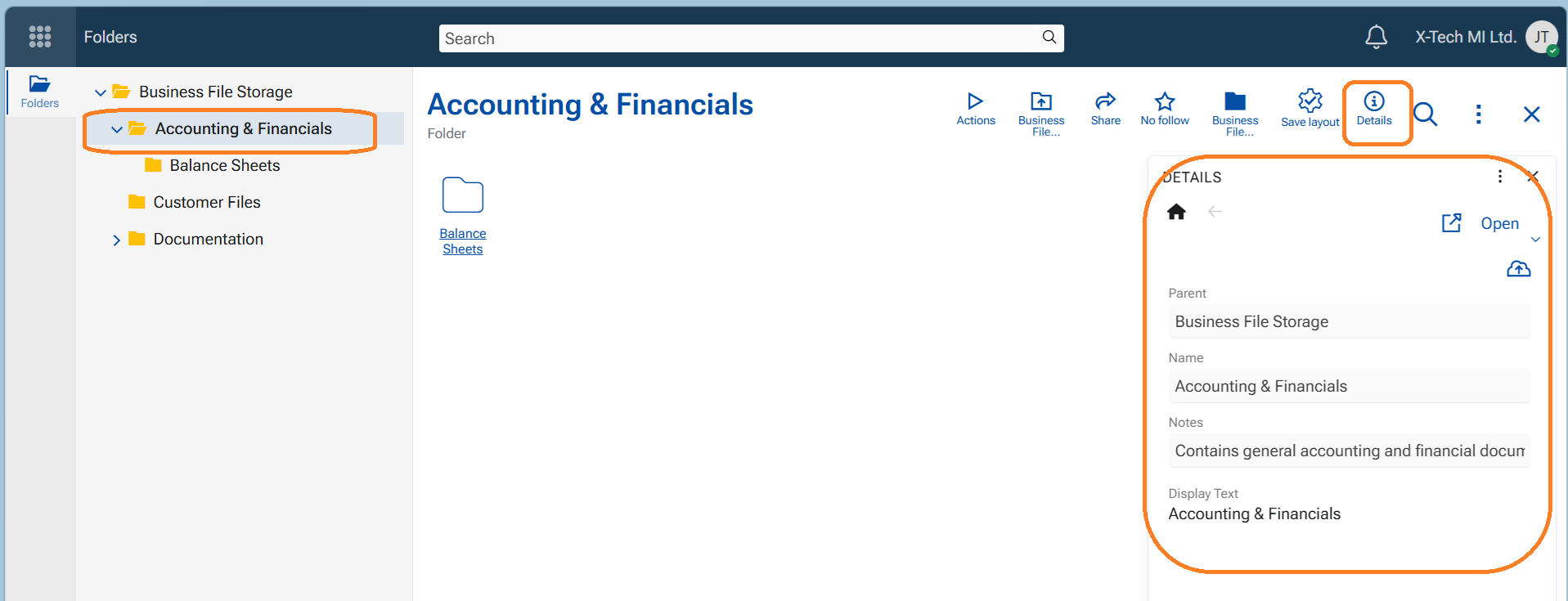
Details
Use to open a side panel "Details" with selected fields that describe the current record (e.g. Project, Assigned to User, Customer - any field that belongs to the definition of the object).
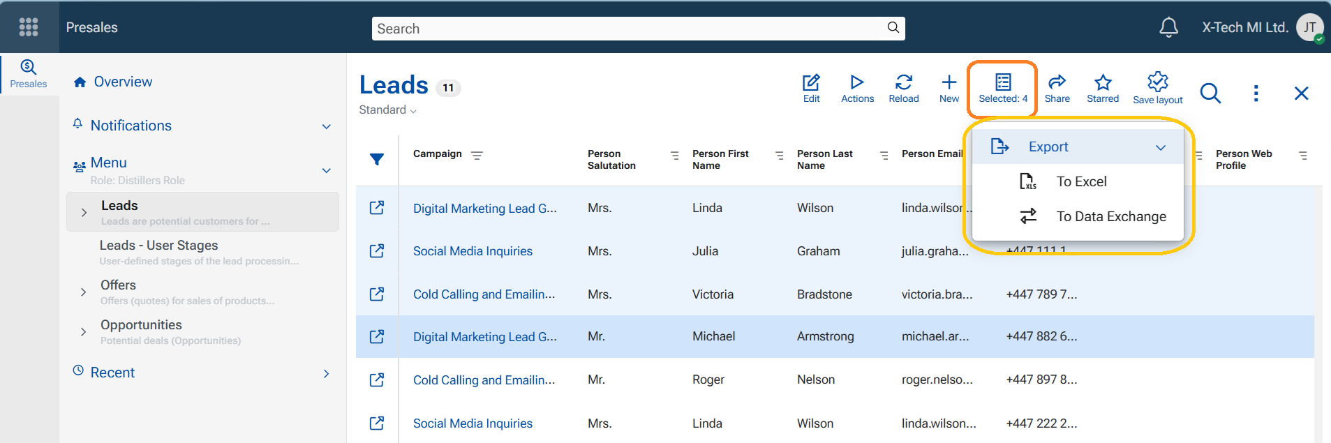
Selected
Appears in the navigator immediately after a record (row) is focused. It indicates the number of selected records.The button has an indicative function—showing how many records are selected—and also serves as a gateway to the "Export to Excel" and "Export to Data Exchange" functions.
- When "Export to Excel" is executed, the selected records are converted into an automatically downloaded Excel file.
- When "Export to Data Exchange" is executed, the system creates a record in Exchange / Data Exchange, which is then executed at a specified time.
Save layout
The sole function of this button is to save layout modifications so that the form is loaded as intended.
It appears in the session of a user who has permission to edit layouts (either Global Layout Manager permission or Layout Admin for the role). When a layout modification is made—whether to a form, a panel, or settings in the Advanced Filter panel—it becomes visible in navigators and single-record forms.
The button appears in two colors:
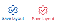
- Blue – indicates a minor modification, such as resizing or hiding a column in a navigator, sorting data, showing or closing a side panel, or adding or changing a filter in the Advanced Filter panel.
- Red – indicates a major modification made via the Customize Form or Customize Panel menu options. This alerts the user that the button should be pressed.
If the user does not press the button, the layout modifications will not be saved for the role, and the form will not be delivered according to the latest customizations. For this reason, this button is essential for platform administration and workspace consistency.
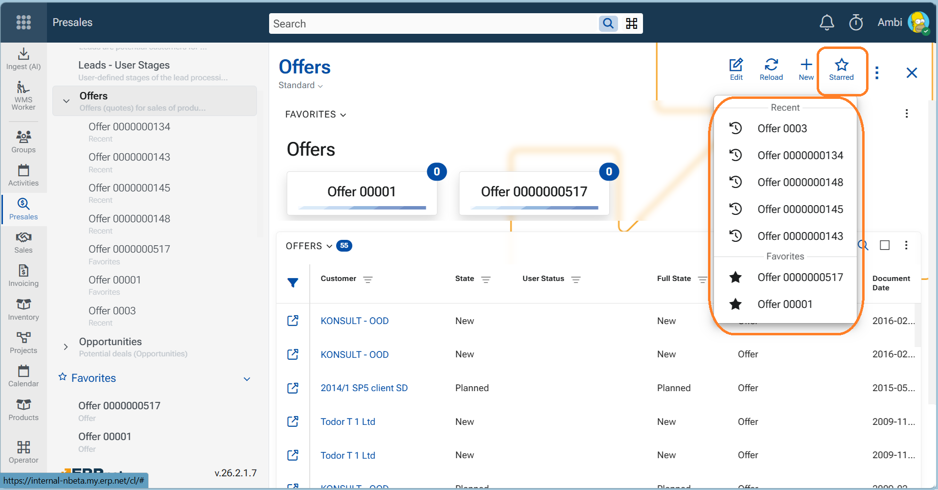
Starred
This button is visible in navigators. When clicked, it reveals a list of max 5 Recent and max 15 Favorite records for the currently observed entity type. For example, if a user opens the Offers navigator, the Starred button displays recent and favorite offers. Clicking a listed item opens the corresponding record.
Follow star
Appears in single-record forms and is used to indicate and set the importance of a record for the user. Based on this setting, the user receives corresponding notifications about updates and comments on the followed object.
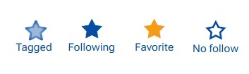
Each click on this button sets a new follow level, meaning:
- Tagged - You are following the object automatically, typically because you were mentioned or assigned. Cannot be set manually.
- Following - You explicitly chose to follow the object.
- Favorite - You explicitly marked the object as a favorite. Favorites are shown in the Favorites app.
- No follow - You do not follow this object, or no longer follow because the follow record is deleted now Learn more about Social Follows.
Share
Appears in single-record forms and allows the user to share the current record in three ways:
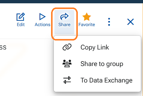
- "Copy link" – copies the URL of the current record to the clipboard, where it can be pasted as needed.
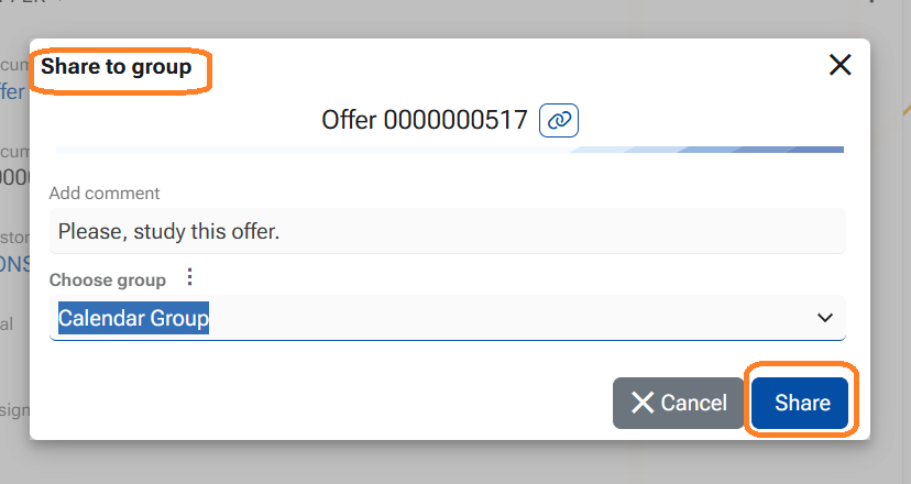
- "Share to group" – opens a dialog for selecting a Chat group of which the user is a member. A relative link to the record is posted as a comment in the selected group’s chat. Group members gain immediate access and can open the shared record directly.
- "To Data Exchange" – creates a record for execution in Data Exchange.
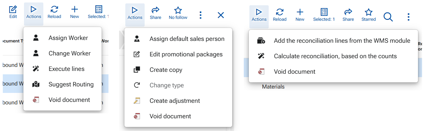
Actions
Available in single record forms in navigators. The Actions button (previously Run) opens a drop-down menu with the available actions you can execute in the current context.
The list of actions is context-driven and may vary depending on:
- the current record/document type,
- the document state,
- the configured workflows or document routes.
Examples of actions you may see include operations such as "Create copy", "Void", "Create Adjustment", "Assign Worker", creating follow-up documents (when applicable), and many more. Some examples:
Learn more about Running UI functions by "Actions" and from the dedicatet UI function pages available to any namespace.